
If you are a Buffett & Munger follower, you should be intrigued by University of Berkshire Hathaway: 30 Years of Lessons Learned from Warren Buffett & Charlie Munger at the Annual Shareholders Meeting by Daniel Pecaut and Corey Wrenn. Anyone can buy all the old BRK shareholder letters, but there are very few transcripts from the live shareholder meetings in Omaha, Nebraska (1986–2015). There is definitely overlap, but these live interactions sometimes provide a peek into their less-publicized opinions (especially Munger’s). Here’s how the authors describe the book:
This book isn’t for the first-time investor. It’s for the informed investor who sees the value of being able to get deep into the mindsets of Warren Buffett and Charlie Munger. If you want to walk around in their shoes for the past three decades, absorb what works, and then apply it to your own investments, then this book is for you.
The current price is only $0.99 in Kindle format. At that price, it should be an easy decision on whether to own the entire book forever, but here are my personal notes and highlights to give you an idea of the contents:
How Berkshire Hathaway differs from other actively-managed stock mutual funds:
The public has long viewed Berkshire as a sort of mutual fund with large stock holdings. This view underestimates or ignores 1) Berkshire’s insurance companies’ impressive generation of low-cost float, 2) Berkshire’s impressive and growing stable of cash-generating operating businesses, and 3) Berkshire’s ability to orchestrate value-enhancing deals.
Classic quote on stock market prices:
Buffett noted that many investors illogically become euphoric when stock prices rise and are downcast when they fall. This makes no more sense than if you bought some hamburger one day, returned the next day to buy more but at a higher price, and then felt euphoric because you had bought some cheaper the day before. If you are going to be a lifelong buyer of food, you welcome falling prices and deplore price increases. So should it be with investments.
Luck and the Ovarian lottery:
Buffett launched into an intriguing thought problem he called “the ovarian lottery.” You are to be born in 24 hours. You are also to write all the rules that will govern the society in which you will live. However, you do not know if you will be born bright or retarded, black or white, male or female, rich or poor, able or disabled. How would you write the rules? Buffett said how one comes out in this lottery is far more important than anything else to one’s future. He and Munger were huge winners having been born American (“in Afghanistan, we wouldn’t be worth a damn”), male (at a time when many women could only be nurses and teachers), white (when opportunities for minorities were slim) and good at valuing businesses (in a system that pays for that like crazy). Buffett noted it is important to take care of the non-winners of the ovarian lottery. Therefore, some sort of taxation is in order. Given that few people with money and talent are turned away from free enterprise under the current system, the 28% capital gains tax is probably okay.
Investing in yourself:
Buffett asserted that the very best investment you can make is in yourself. Buffett shared that, when he talks to students, one of the things he tells them is what a valuable asset they have in themselves. Buffett would pay any bright student probably $50,000 for 10% of their future earnings for the rest of his life. So each student is a $500,000 asset just standing there. What you do with that $500,000 asset should be developing your mind and talent.
State-sponsored legal gambling:
Buffett asserted that to a large extent, gambling is a tax on ignorance. You put it in, and it ends up taxing many that are least able to pay while relieving taxes on those who don’t gamble. He finds it socially revolting when a government preys on its citizens rather than serving them. A government shouldn’t make it easy for people to take their Social Security checks and waste them by pulling a handle. In addition, other negative social things can flow from gambling over time.
Read, read, read:
Buffett agreed that he is big on reading everything in sight and recommended good investors should read everything they can. In his case, he said that by the age of 10, he’d read every book in the Omaha public library on investing, some twice! Fill your mind with competing ideas, and see what makes sense to you.
Investing with real money:
Then you have to jump in the water—take a small amount of money, and do it yourself. He joked that investing on paper is like reading a romance novel versus doing something else. Munger shared that Berkshire Director Sandy Gottesman, who runs a large, successful investment firm (First Manhattan), asks interviewees, “What do you own, and why do you own it?” If you’re not interested enough to own something, then he’d tell you to find something else to do.
Book recommendations, including The Richest Man in Babylon:
We have often recommended to our friends and clients George Clason’s classic, The Richest Man in Babylon, so we were delighted to hear Charlie speak of it. He said that he read the book when he was young and that the book taught him to under-spend his income and invest the difference. Lo and behold, he did this, and it worked.
Munger also suggested that it is very important to learn how to avoid being manipulated by lenders and vendors. He strongly recommended Robert Cialdini’s book, Influence, for the task. He also recommended Cialdini’s newest book, Yes, noting that Cialdini is the rare social psychologist who can connect the world of theory and daily life.
Note: This a dated quote, and Robert Cialdini’s newest book is actually Pre-Suasion: A Revolutionary Way to Influence and Persuade, published in 2016.
Work for yourself an hour each day:
He got the idea to add a mental compound interest as well. So he decided he would sell himself the best hour of the day to improving his own mind, and the world could buy the rest of his time. He said it may sound selfish, but it worked. He also noted that if you become very reliable and stay that way, it will be very hard to fail in doing anything you want.
Simple career advice:
“Do what you enjoy the most. Work for people you admire. You can’t miss if you do that.”
Investing in stocks (equity) vs. bonds (debt):
Buffett noted that the analytical hurdle for buying a bond requires answering the question, “Will the company go out of business?” while buying an equity requires answering the more difficult question, “Will the company prosper?” This is why Berkshire bought the 15% notes of Harley Davidson rather than the stock. He had no question the company would stay in business, quipping, “You have to like a business where the customers tattoo your name on their chests!” But gauging Harley’s long-term prosperity was much more difficult, especially during the throes of the crisis.
Also see my earlier posts on appreciating your absolute standard of living and why you should maintain some optimism.
Bottom line. If you’re a Buffett & Munger enthusiast, this is a nice addition to your collection. Lots of familiar wisdom but also includes some additional perspective. If you’re not a Buffett & Munger enthusiast, I might start elsewhere, for example with Warren Buffett’s Ground Rules if you’re not ready for the original shareholder letters. Here’s to hoping the authors will do a similar book on the Wesco Financial meetings with Charlie Munger.


 In my
In my 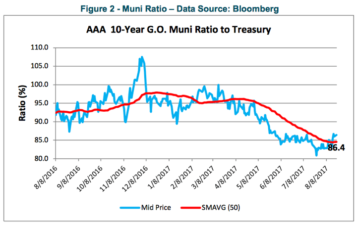

 The wealth management group Del Monte published a


 One of the early books that impacted my investing philosophy was


 The Best Credit Card Bonus Offers – 2026
 Big List of Free Stocks from Brokerage Apps
 Best Interest Rates on Cash - 2026
 Free Credit Scores x 3 + Free Credit Monitoring
 Best No Fee 0% APR Balance Transfer Offers
 Little-Known Cellular Data Plans That Can Save Big Money
 How To Haggle Your Cable or Direct TV Bill
 Big List of Free Consumer Data Reports (Credit, Rent, Work)