![]() Vanguard has announced that it is lowered the minimum required investment on the Admiral Shares of its index funds to $3,000, down from $10,000. Basically, if you owned the Investor Shares of one of their 38 index funds, you will own the cheaper Admiral Shares with no effort and no tax issues. You can perform this conversion manually if you don’t want to wait for them to do it for you. Good deal.
Vanguard has announced that it is lowered the minimum required investment on the Admiral Shares of its index funds to $3,000, down from $10,000. Basically, if you owned the Investor Shares of one of their 38 index funds, you will own the cheaper Admiral Shares with no effort and no tax issues. You can perform this conversion manually if you don’t want to wait for them to do it for you. Good deal.
Alternatively, you may use this as an opportunity to spread your money across more funds due to this change. This would be bigger news, but a lot more people now own the ETF versions. I still remember in 2010 when Admiral Shares went from a $100,000 minimum investment down to $10,000. Note that this does not apply to Vanguard’s actively-managed funds, which are still at $50,000 for Admiral Shares.
In early November, Fidelity removed all investment minimums on their mutual funds. They also gave every investor in their funds the lowest expense ratio available in any share class, usually the ones for their institutional customers. For example, the Fidelity Inflation-Protected Bond Index Fund (FIPDX) now has an annual expense ratio of 0.05% with a $0 minimum investment, even lower than the Admiral Shares of Vanguard Inflation-Protected Securities Fund (VAIPX) at 0.10% which still requires a $50,000 minimum investment as it is an actively-managed fund.
I still have the majority of my investment portfolio held at Vanguard, but it appears that Fidelity has finally woken up from it’s “Let’s Pretend Index Funds Don’t Matter” slumber. (See Bloomberg interview.) Vanguard may deny it, but I think the current asset-chasing, expansion-minded Vanguard does respond to competition.
The trend continues. Anyone today can build a dirt-cheap index fund portfolio with Vanguard, Fidelity, Schwab, and iShares, and those portfolios keep getting cheaper and cheaper. The hard part will be sticking with your portfolio when you’re balances start shrinking.


 Investment research firm Morningstar has released their annual 529 College Savings Plans

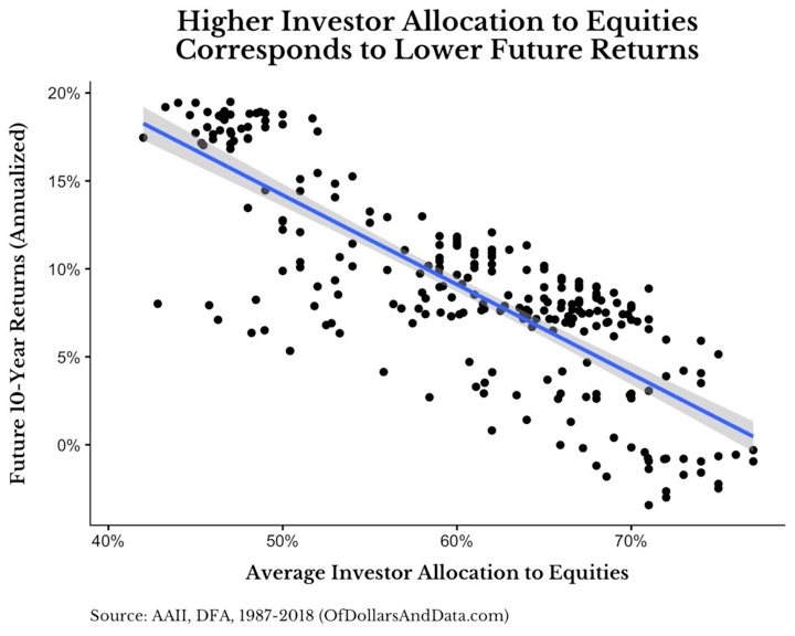
 A recurring theme in my asset allocation philosophy is to stick with simple and safe bonds in your portfolio. The problem is, there will be other bonds that outperform safe, shorter-term US Treasury bonds and you might start to question your decision. I try to remind myself to consider how they fit into your entire portfolio. I would rather take on risk with stocks due to their big upside potential and use bonds for stability in times of stress.


 When you’re deciding where to invest your money, a good starting point is to consider every single business that you can invest in around the world. I still find it amazing that with a few clicks, you can own a share of Alibaba in China, Nestle from Switzerland, and Apple in the US.
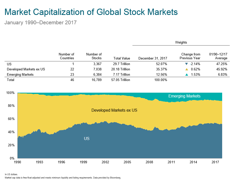


 The Best Credit Card Bonus Offers – 2026
 Big List of Free Stocks from Brokerage Apps
 Best Interest Rates on Cash - 2026
 Free Credit Scores x 3 + Free Credit Monitoring
 Best No Fee 0% APR Balance Transfer Offers
 Little-Known Cellular Data Plans That Can Save Big Money
 How To Haggle Your Cable or Direct TV Bill
 Big List of Free Consumer Data Reports (Credit, Rent, Work)